

It is amazing how sometimes when designing a logo a designer starts from an idea to then elaborate and redesign the same logo in various stages up until the “final / FINAL / LATESTS FINAL” version of it.
The pictures below show the stages it took me to design a recent logo.
 After seeing some of the documentation the client had on his hands from its previous business and web site design I come to understand that he wants something simple yet firm and memorable. As I have designed its website using light and dark brown color tone I decide to stick with this colors and after watching a magazine from the 70’s design I come out with a “squary” idea of lettering and design. The photo to the left is a draft I jotted down on my notebook.

This is the result after a few attempts and hit and miss on Illustrator. Initially the all logo is only outlined. I then decided to fill it with something like wood which sticks with the color notes I have in mind but also plays well with the retro 70′ design I got the idea from. Secular wood, (which is the type I chose), is also a symbol of persistence, continuity, strength, life and growth. The font are a mix of retro from the 80′. Having old magazines laying around in my desk has been a key feature for my inspiration.

After showing the logo to the client and explaining the characteristics I realize a massive contradiction in the logo that I did not noticed before. The all website is written in lowercase. The client has specifically asked not to use uppercase. I must have been blind or what? I actually designed the all website and now I am doing a logo in capital lettering..? I quickly re sketch.
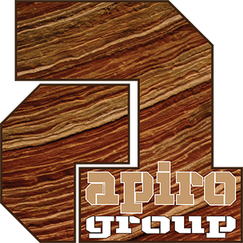
This the logo redraw in lowercase, I had to change the lettering as it won’t fit as the original.
The client sees it and quite like it, however he want’s to see a flat version with no pattern.

And there it is, using the same tones of light brown and dark outline the new iteration is ready to be presented to the client.
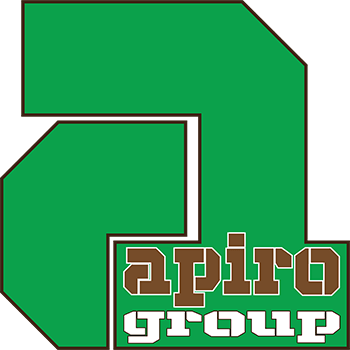
It is great….but let’s see a green version. Green is the color for anything organic, eco friendly, new…and so on…
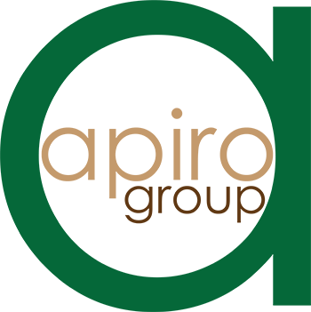
Only one thing though. The fonts on the website have been recently changed to a very round one. how about we make the logo similar so that we keep it in line..?
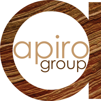
Finally…we like the logo, but….hey the wood is a winner.
Here it stands a company brand new logo.
How do you draw your logos? If you feel like you want to share your expertise, you are welcome to drop your comments.
About the Author

Digital Designer, blog writer and also a tech enthusiast.
He loves to write content for blogs, podcasts, design websites, logos, brochures, banners and anything that sends a message to an audience.
You can contact Daniele at the link below:


