


Full Width Slideshow Hero Header With Responsive Menu

This header is made with Elementor free so it is OK for all those who haven’t yet made the jump into Elementor PRO or have just started using Elementor.
The header is composed by three main columns. Starting from the Left and going to the right side of the screen we have an image logo then the menu and finally the social widgets.
The slideshow plays in the background.
The Responsive Navigation menu is made via the Elementor HTML widget and can be customized at your best liking.
Note:
This template is best used with the Elementor Canvas In mind so that you have full control of the layout and design of your page.
How to set up your new header:
- Download the zip file containing the following”
a. json file
b. logo
c. image headers for slideshow - Upload the json file to your template library (image 1)
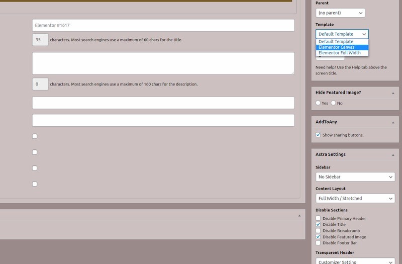
- Create a new page or edit an exixting page, make sure you are using the “Elemetor Canvas” (image 2).
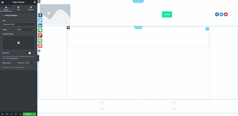
- Add the new json template to the page. This should be a blank page…or if you already have content you should move this new created section to the very top (Image 3).
- Now you can see the menu on the right and the social icons but probably you will not see the logo or the slideshow. Click on the image at the left top corner and upload your logo or the reference one that is included in your download zip. For a better result your logo should be a transparent .png file (image 4).
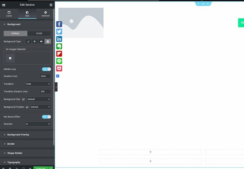
- It is now time to add the slides to the slideshow that is already configured by the json file. Click on the section settings icon and then select the style tab, you will see a + sign, click in there and add the three slides provided in your download zip file (image 5).


Changes to the responsive navigation menu will be applied via the HTML/CSS widget, from there you can change font type / color / paddings and so on).
<!DOCTYPE html>
<html>
<head>
<meta name="viewport" content="width=device-width, initial-scale=1">
<link rel="stylesheet" href="https://cdnjs.cloudflare.com/ajax/libs/font-awesome/4.7.0/css/font-awesome.min.css">
<style>
body {
margin: 0;
font-family: Arial, Helvetica, sans-serif;
}
.topnav {
overflow: hidden;
background-color: transparent;
}
.topnav a {
float: right;
display: block;
color: #f2f2f2;
text-align: center;
padding: 8px 16px;
text-decoration: none;
font-size: 18px;
}
.topnav a:hover {
background-color: #ddd;
color: black;
}
.topnav a.active {
background-color: #00ED97;
color: white;
}
.topnav .icon {
display: none;
}
@media screen and (max-width: 600px) {
.topnav a:not(:first-child) {display: none;}
.topnav a.icon {
float: right;
display: block;
}
}
@media screen and (max-width: 600px) {
.topnav.responsive {position: relative;}
.topnav.responsive .icon {
position: absolute;
right: 0;
top: 0;
}
.topnav.responsive a {
float: none;
display: block;
text-align: left;
}
}
</style>
</head>
<body>
<div class="topnav" id="myTopnav">
<a href="javascript:void(0);" class="icon" onclick="myFunction()">
<i class="fa fa-bars"></i>
</a>
<a href="#contact">Contact</a>
<a href="#news">News</a>
<a href="#about">About</a>
<a href="#home" class="active">Home</a>
</div>
<script>
function myFunction() {
var x = document.getElementById("myTopnav");
if (x.className === "topnav") {
x.className += " responsive";
} else {
x.className = "topnav";
}
}
</script>
</body>
</html>
That’s it. You now have a fully functional header with background slideshow and responsive menu. This is a basic setup but with Elementor you can add a ton of customization so if you like to have it with different features feel free to play with it.
As usual thank you for visiting this site and keep designing!

Digital Designer, blog writer and also a tech enthusiast.
He loves to write content for blogs, podcasts, design websites, logos, brochures, banners and anything that sends a message to an audience.
You can contact Daniele at the link below:


