

Table of Contents
How to drop a better shadow in Canva shapes?
When reading this article you might think…hey, wait a minute, didn’t this guy already talk about shadows in Canva? What’s all the fuss then?
Well…yes…but no. I mean, yes I did write in the past, but no….this post has no reference to it.
If that is what you are thinking, you are probably referring to this article here where I go in details on how to use Gimp to cast a shadow of your objects (in relation to mockup design) but that tutorial is a bit more for advanced users as it includes the use of the “perspective tool” which not everyone is accustomed with.
Today we are still going to use Gimp (as always…the best all around), but this time we are going to show you how to pre-make shadows that you can then upload in a folder of your choice in your Canva account. This way you can use them together with canvas shapes such as the square, rectangle, ellipse etc. and have a perfect shadow to give a better look or a more realistic one for that matter.
If you think that spending time with Gimp is too much of a hassle and are asking yourself: Do I have any alternatives? Well you could just do as many people do right now, you could drop a shadow by placing a darker copy of your shape as a bottom layer (underneath your shape) then lowering the transparency will do the rest. However, that is a very quick fix but will not give you that smoothness required to have a top notch shadow as the lines and the corners will be still to sharp. Hence if you want to follow this tutorial, you’ll just have to do it once and then you can use the same shadows all the time….so let’s get on with it!
Part 1 – Creating the Basic Shadow Box in Gimp
First of all let’s prepare our environment. Go ahead and fire up Gimp, once loaded create a new blank canvas with a solid background.

Use the select tool, make sure you have the additional options selected as per the image below. (Antialias on, Feather edges on with the value you want, I did not do more than ten as I like to use another tool for the edges. More on that later on point 7, Radius on up to 20, expand from center on, aspect ratio fixed).

Now point in the middle of the canvas, click and drag over t the edge as to form a perfect square. Place the square in the center of the canvas, make sure you leave some margins allover as we will need that space too later.

From the layer menu scroll down to Transparency >> Add Alpha Channel, click to select.

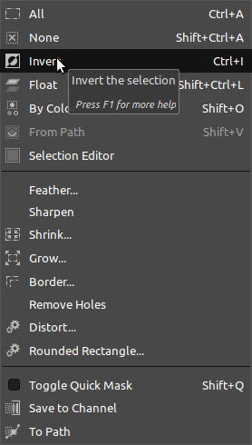
From the select menu choose “invert”, you can also just use the keyboard shortcut CTRL/CMD + I.
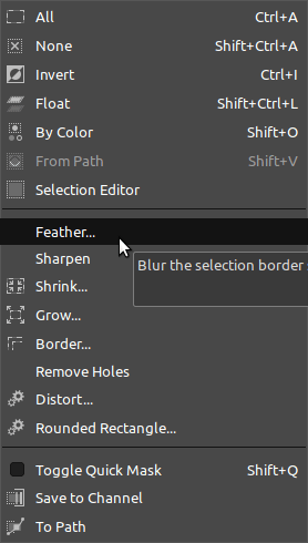
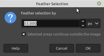
Now we are going to use a better feather tool, still from the select menu, choose feather and give it a good value (I have chosen 55).
Press delete and you will remove the margins.

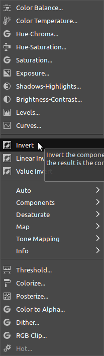
From the color menu select “invert” and your shadow square is now dark.
That’s it save and export your transparent png.

Part 2 – The Canva usage
OK, I am logged in in m y account at Canva and I have already created an exra folder for my shapes so that I can reuse them every time I want.
Let’s create a new blank design and subsequently upload the Shadow shape we have just made in Gimp in our dedicated folder (or anywhere you like).

Select the square shape from the elements menu and give it the color you would like to be. In my case I would like it to be white with a blue border.


Now is show time, browse to your dedicated folder and drag the shadow shape into the canvas.

Bring down the shadow underneath your square shape and adjust the position in order to be as you like it to be.


Almost done, the shadow look good, however, for me is a bit too dark, let’s scale down the transparency.

That’s it. Look at it, isn’t it better?
You can follow the same steps and create your own rectangle, circle, triangle etc. Once you have done the first, the rest of the shapes will take 5 minutes and once you have it all you have got all the shadow you need for better Canva Graphics.
Below is an example of this type of shadow (left) compared with the “tricky” one of adding a transparent darkened copy of a the shape in use (right). I don’t know what you think but I have no doubts in preferring this one. At least for most of the creative job I do, when I need something smooth….this is much more looking ….like a shadow, while the “quick trick” type is still OK but not for everyday use or at least , that’s my opinion. Great, go and master it now.
See you soon with some more graphics tweaks, until then…stay creative!

Digital Designer, blog writer and also a tech enthusiast.
He loves to write content for blogs, podcasts, design websites, logos, brochures, banners and anything that sends a message to an audience.
You can contact Daniele at the link below:


